How is it going, Brawlers? Today, we’ll dive into the backgrounds of Mayhem Brawler: Best of Both Worlds.
Who is Rabia?
I’ve been part of the Hero Concept team, breathing life into the Mayhem universe for about four years. Initially, I was a painter who wanted to create 3D environments, but my journey in the industry began with coloring character animations for Mayhem Brawler. Back then, I had created backgrounds for the upcoming game, and now I’m one of the few individuals working on the backgrounds for Mayhem Brawler: Best of Both Worlds.
How It Started?
This was both exciting and frightening for me. Even though I had created small 3D models before, this time, I had to bring to life cities, shops, concert halls, and various concepts. After numerous brainstorming sessions, small experiments, and lengthy discussions about what we wanted to achieve, we started the practical aspect by preparing a template.
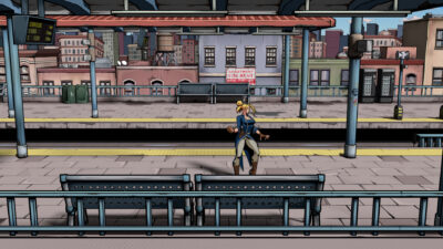
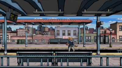
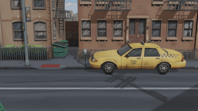
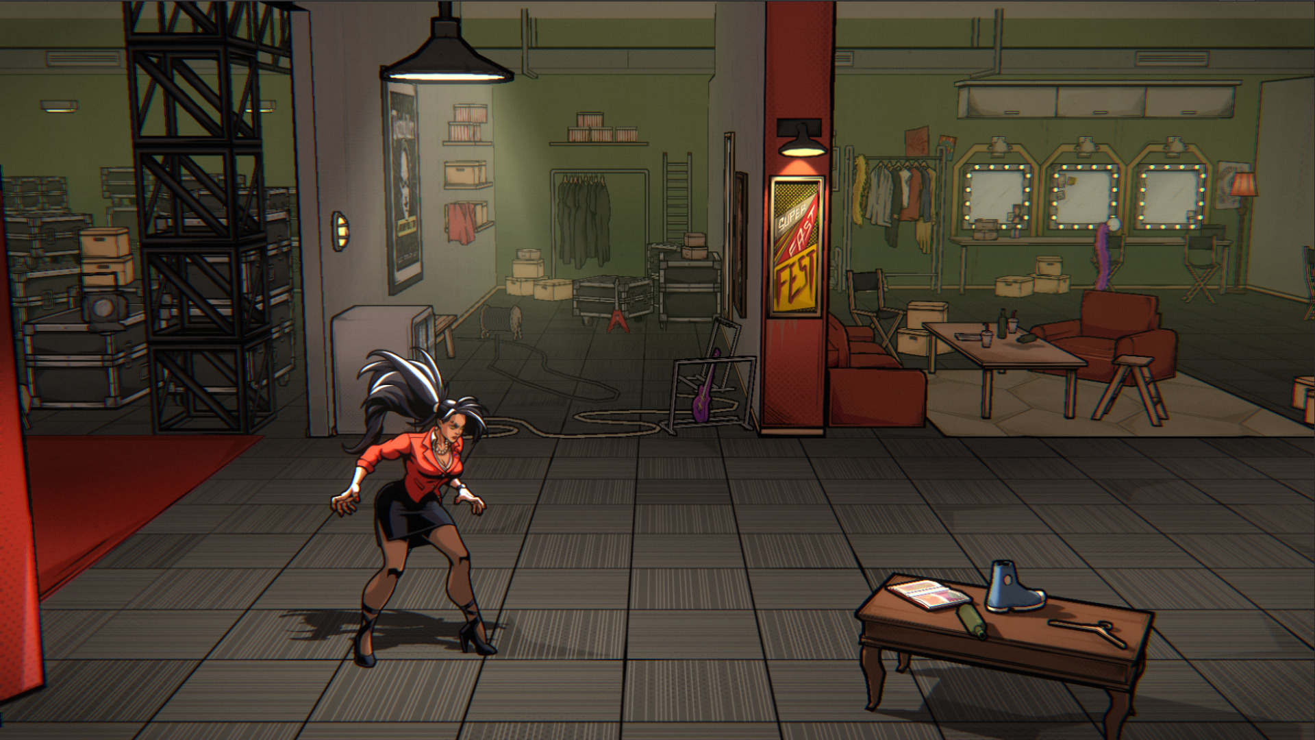
Unlike backgrounds in the previous game, we aimed to enhance the sense of depth with 3D environments while keeping characters in 2D. So, we can describe it as 2.5D. Achieving harmony between 3D backgrounds and 2D characters was about style and the camera angle. Therefore, we tilted the camera and characters by 10 degrees in the vertical plane to obtain a diagonal view.
- Diagonal Camera Angle
- Standard Camera Angle
Capturing the Comic Book Style
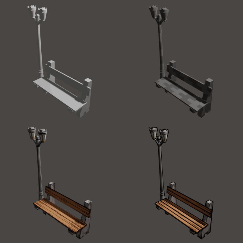
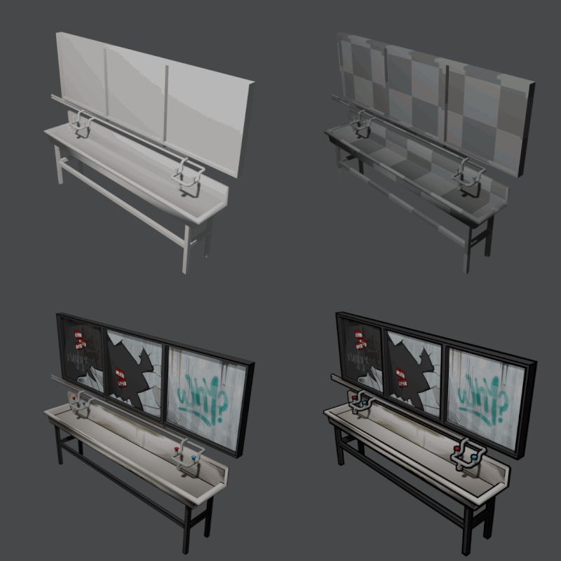
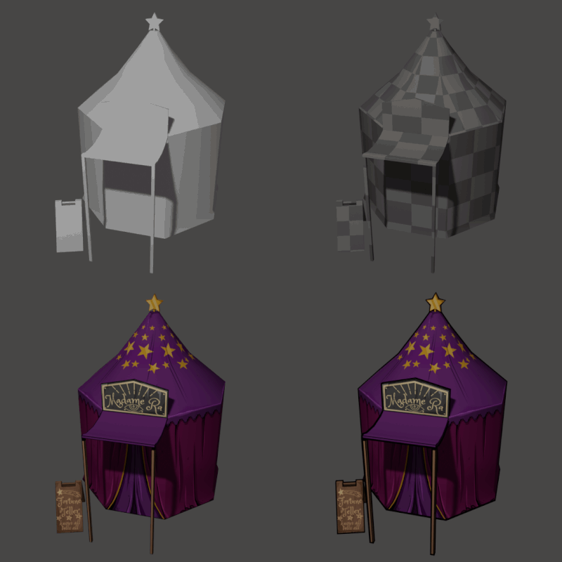
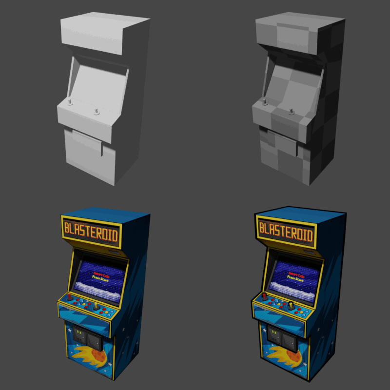
We had an apparent reference for the style: the previous game. Therefore, it was evident from the beginning that we would present a story in a comic book style. After finding accurate references for each level and transforming them into 3D models, we adapted them to the style we defined in the texture part. Objects were generally in actual dimensions, but we also stylized some to capture a better essence. I can say that one of the most enjoyable parts of the job for me was texture painting.
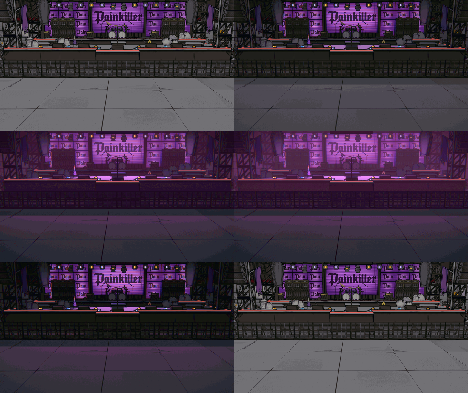
To capture the comic book style during the texture stage, we progressed by layer upon layer. In the initial release of unfinished game visuals, we received feedback from players who were familiar with us. Parallel to the feedback we received, we also had our questions. In response, we returned to the sections we created and started the process of color correction again.
As we approached our desired look with more lines and scans, using an outline shader helped us establish a city in a comic book style. When the new visuals were released, they satisfied players who were following us and addressed the concerns we had received earlier.
- Before
- After
Time Transition
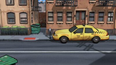
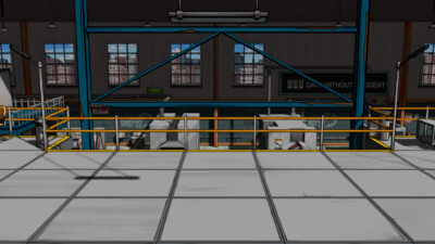
Locations also change their new forms by experiencing a leap of 20 years in two different time periods. At this point, there were some crucial aspects we needed to pay attention to. From a purely technical perspective, there was a necessity for objects to share the same space in terms of mass, and consequently, the walking areas for characters had to be the same in both time periods. Aesthetically, despite a complete transformation after 20 years, we tried to leave behind some visible, familiar structures. This way, even though the player navigates in a completely different time when experiencing time jumps, they can still see familiar traces. Observing these time transitions can be pretty exciting.
- Past
- Present
Turn on the Lights!
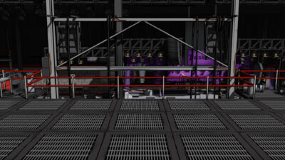
Lighting the levels is like the polishing stage for us. It’s one of the moments that makes me most impatient for each level. At this point, I’d like to note that my favorite scenes are the night ones. I must say I enjoy seeing the lights we’ve lit up there. If it’s an outdoor environment, our job is more straightforward; we add lights and modes that suit the predetermined time frame for that level.
But indoors, due to the game being 2.5D, we’ve encountered unexpected issues. Since the characters were cardboard, meaning they had no thickness, they lost their shadows when it came to lighting. When the light was in front of them, it changed the direction of the cloud, causing an unnatural movement due to their 2D nature. Despite not wanting to compromise on the design, prioritizing lights that cast shadows was the ideal solution. We decided the remaining lights would only illuminate the environment without casting shadows. This way, we achieved a smoother point for the shadows cast by 2D characters on the ground.
In this Dev Diary, I’ve tried explaining how we created and scaled Mayhem City and prepared the scenes. We are thrilled with where we’ve come from and the feedback we’ve received. We eagerly look forward to finishing the rest of the game and sharing it with you all!
Also, join our Discord Server to hear first about the updates & share your suggestions with us!
— Rabia, 3D Artist

